- Share How We Redesigned the Curata Blog for Instant ROI [Case Study] on Facebook
- Share How We Redesigned the Curata Blog for Instant ROI [Case Study] on Twitter
- Share How We Redesigned the Curata Blog for Instant ROI [Case Study] on Linkedin
- Share How We Redesigned the Curata Blog for Instant ROI [Case Study] via email
Curata overhauled our blog over April and May. Many painstaking hours and dollars later, we have a completely new blog. Two months after relaunch, we’ve seen a boost in blog traffic, decreased bounce rate, and enjoyed faster page loads.
Why bother? Redesigning your blog should not only give it a sexy new look, it can improve everything from SEO to blog traffic to click-through rate. According to surveys by Akamai and Gomez.com, nearly half of web users expect a site to load in two seconds or less, and they tend to abandon a site that isn’t loaded within three seconds. Fifty two percent of users said that a bad mobile experience made them less likely to engage with a company. Seventy percent of consumers today learn about a company through their blog, rather than ads.
Business blogging is de rigueur now, and audiences decide a lot about a brand from its blog. So we saw a need for improvement. Two months after our redesigned blog launched, we’ve significantly increased blog traffic and time on page, faster load times and a decrease in bounce rate. (We’ll go into more detail on results later.) First though, we’ll walk through how we decided a blog redesign was the right call for Curata.
Should You Do a Blog Redesign?
From blog traffic improvements to a better aesthetic, there are many reasons why you should or shouldn’t do a blog redesign. Here are the pros and cons we weighed before determining a blog overhaul was smart for Curata.
Reasons to Do a Redesign
- Curata’s blog aesthetic was outdated: our images were small, formatting was poor, and we weren’t using white space well
- Our bounce rates were high: the existing layout made it almost impossible for users to find other great content on our website
- Pages loaded slowly: This made for a poor user experience. This negatively affected Curata’s SEO ranking and blog traffic goals
- It didn’t reflect our product or our brand well: We believe our software is sexy. But the look of our blog wasn’t confidence inspiring branding for potential customers or partners. This made it easier for people to ignore our great content
Reasons NOT to Do a Blog Redesign
- Redesigns can be pricey
- They take time away from other content initiatives
- Redesigns are a headache. They can cause you to lose information, mess up analytics, or even crash your website
- You could end up with something worse than what you currently have—just in different ways
Other Factors
For reasons unknown, we hadn’t ever reached out to our blog subscriber list. While Curata’s blog had a subscription option, the list of subscribers had somehow never been emailed. We’d also never promoted the option to subscribe, or encouraged interested parties to do so. A relaunch was a great way to re-engage with this audience.
Looking at the pros and cons, we decided that with careful budgeting, time management, and an understanding of potential setbacks, the benefits far outweighed the drawbacks. So the Director of Content, Mitchell Hall, and VP of Marketing, Amber Stevens, developed a plan for redesigning our blog.
8 Steps for a Blog Redesign
Here are the steps we took.
1) Identify Criteria and Loop in Key Stakeholders
Our content director and marketing head set about establishing the necessary criteria for what we needed from the new blog. Here are some of the questions they asked when deciding on an agency:
- What kind of clients has a prospective agency had in the past?
- Do you know anyone who’s used the agency?
- Is your existing team capable of taking on the work involved in the relaunch?
- Do you need an agency to provide everything in-house, or is outsourcing ok?
- How reachable/available do you want your agency to be?
- How much budget do you have for a redesign?
- What’s the timeline?
Based on these questions, here’s the criteria Curata’s marketing team came up with for the agency that would design our blog:
- A history of B2B SaaS clientele
- Personal reference from us, or someone we knew
- In-house technical and design
- Not outsourced to contractors
- Ideally located in same time zone
- Within our budgetary constraints

From there, we pitched our reasons for the redesign, agency criteria, and goals to other stakeholders in the company. We wanted to make sure we weren’t leaving anything out. It’s important to keep other parties in the loop during this process. For us, the key parties outside of the marketing department were Curata’s CEO, Pawan Deshpande, and the head of engineering, Jeff Suarez.
2) Define Your Blog
A blog redesign is destined for failure absent a clear vision of what you want to achieve. So it’s important to figure out what the new blog should look like, its tone, and the functionality you want. There are a variety of exercises you can do to determine your blog’s voice. Here’s some we did:
- Create a mission statement for the blog. What’s the point of the blog?
- List out as many adjectives as you can think of that describe the personality of the blog.
- Narrow the list down to five adjectives.
Here’s what we came up with:
We wanted to strike a balance between corporate and playful by showcasing something unique/eccentric within the design/consumption experience.
Adjectives we felt describe the personality of Curata blog:
- Bold
- Honest
- Authentic
- Sharp, with a sense of humor (but not snarky or cheeky)
- Authoritative
How Can Your New Blog Reflect This Definition?
Once you’ve defined your blog’s personality, brainstorm with other stakeholders on how the redesign can better express it. Look at other blogs your audience likes to read, or that have an aesthetic you’d like to emulate. This will provide a clearer understanding of what the blog redesign means.
Curata’s key aims for our blog redesign were: A bolder design that made better use of white space. Using more and larger images. And most importantly, better displaying our content so that people could more easily find interesting things to read; stay on the site longer, and come back more often.
3) Find a Design Agency
After making these decisions and developing a criteria for the agency we needed, we reached out to personal contacts at agencies, and narrowed our options down to two compelling bids at the same price. Ultimately we went with the agency that, in this case, had a little more flexibility with the final number: Fresh Tilled Soil. FTS were highly recommended, had a great creative portfolio, a knowledgeable team, the in-house skills to do custom development if needed, and they were flexible in meeting our needs with cost and timeline.

4) Work With the Agency On Design and Layout
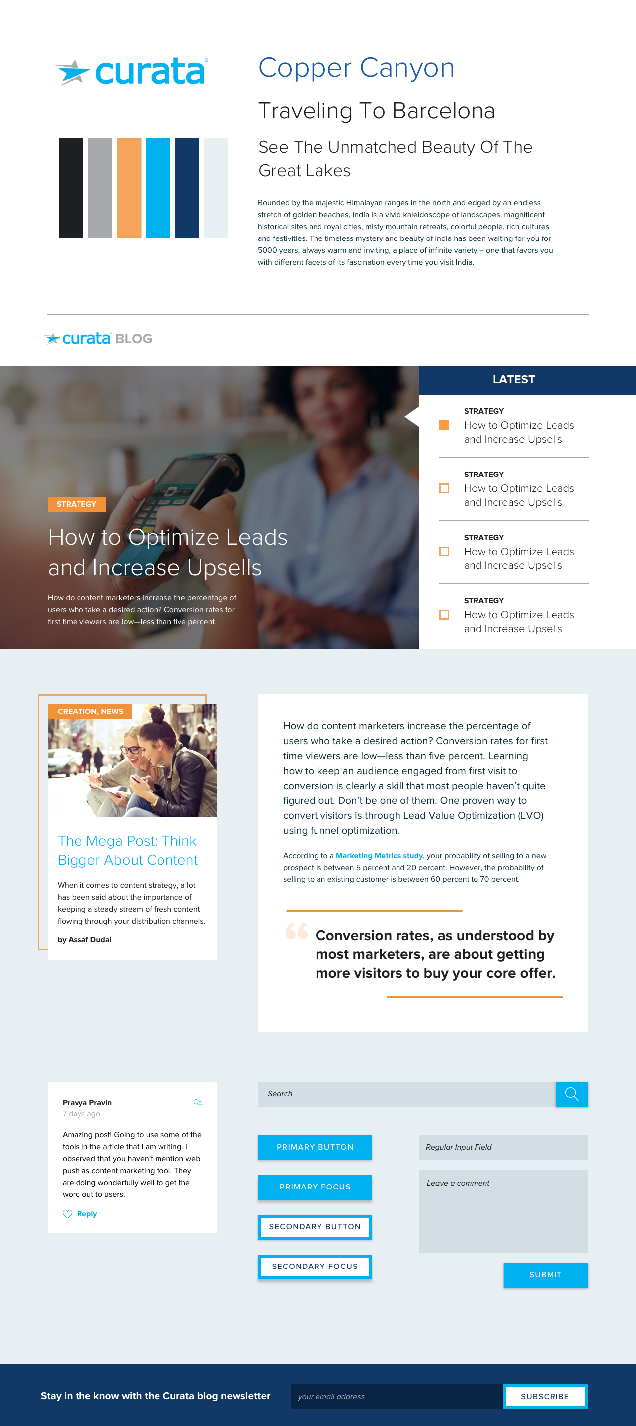
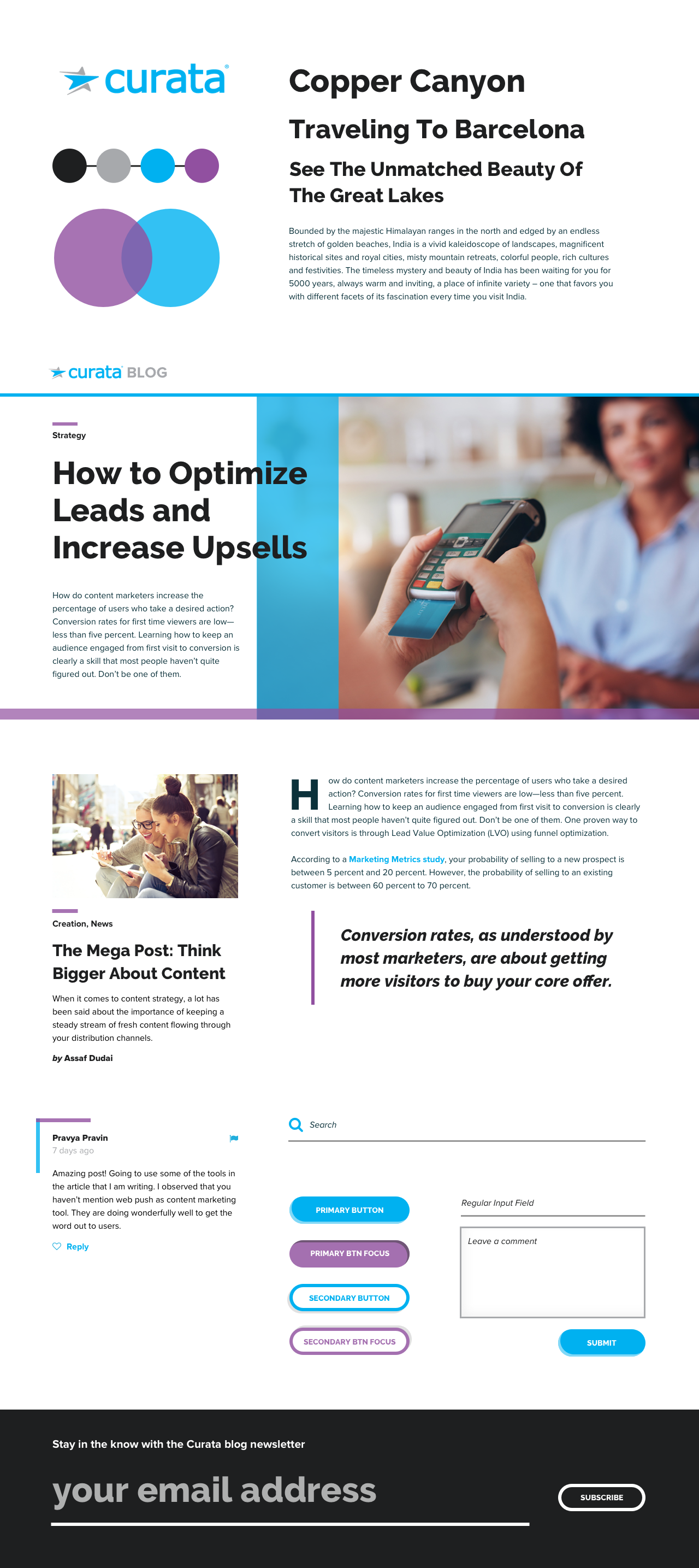
Schedule a meeting to go over what you want out of your relaunch from your agency. They should come back with several options for the new design. Here are some of the first design aesthetic options Curata was given:
We then scheduled a meeting with all internal stakeholders to go over the options and figure out what we liked and didn’t like.
Over several weeks of further iterations, we decided on a final color scheme, CTA, banner, home page layout layout, category page layout, and article page layout.
5) Optimize for Mobile Experience
More users now access the web from mobile devices like smartphones and tablets than from desktops or notebooks. We knew our website didn’t offer a great experience for blog traffic coming from mobile. So we had to think about:
- Collapsing the topic categories into one menu at the top of the screen
- Figuring out how far down the screen a user had to scroll for our offer pop-up to show
- Determining how related and latest articles would display
- Whether to incorporate a “Read Next Article” prompt on mobile
—Amongst many other factors. Mobile is an essential part of your design brief so the aesthetic and readability of your users’ mobile experience is as good as the desktop experience.
6) Make Decisions About the Details

We continuously collaborated with Fresh Tilled Soil on a weekly basis to determine additional items we wanted addressed. There were constantly new action items we felt would be beneficial to our readers, as well as our content efforts. Here are some of our smaller goals, and the features we implemented to achieve them:
- Let Readers Know How Much They’ve Read Our most popular articles are all over 2,000 words long. So we wanted to help our readers better gauge how much more content they had to read. Accordingly, we added a progress bar that fills with blue as you scroll down Curata blog posts. See it above? You’re more than half-way through.
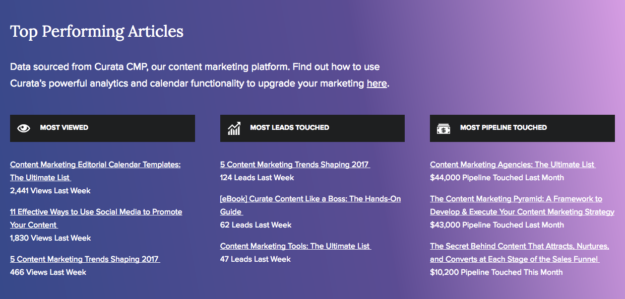
- Show Off Our Sexy Software We strongly believe in our product. Curata sells a powerful content marketing platform that captures sweet metrics that provide us insights that inform our content strategy. We wanted to give our readers a taste of what this software can do, so we decided to display a selection of these metrics on the homepage and at the bottom of every blog post (see above). These content performance analytics show a tease of how useful Curata’s software can be.
- Drive Conversions We also wanted to improve our blog click-through rate and decrease the bounce rate. To help this, we updated the way our CTA’s display, along with their locations.
7) Make Your Launch a Success Post Publication
We wanted to draw attention to our relaunch, so we created a free giveaway campaign to increase blog subscriptions, drive more blog traffic, and re-engage existing subscribers. Then we used email, social, and a small budget for paid advertising to increase our blog subscribers by 35 percent. We also set up email notifications with a new design for when fresh blogs are posted.
8) Analyze the Results
A month after the relaunch, we looked at our blog’s performance to see how it was comparing against previous months. Here’s how we did:
- Performance tests show we halved our page loading time.
- All our analytics metrics have shown noticeable improvement. Compared to a month ago:
- Blog traffic is up 9.71 percent
- Users are up 6.28 percent
- Page views are up 17.19 percent
- Pages per Session are up 6.83 percent
- Bounce Rate is down 1.84 percent and returning visitors are up 3.95 percent
If these results continue to compound over the coming months, our redesign can be considered a success. However, there are some things we’d do differently.
Roadblocks and Lessons
Post-launch, we worked with our vendor on additional issues we didn’t foresee and learned a few lessons. Some of these included:
- It would have helped to have a staging server to enable previews before moving to our live site.
- The vendor focus towards the end of the process seemed to trail off, with a reduction in their otherwise excellent communication.
- Practically speaking, it’s impossible to tease out the impacts of all the various changes
- Related: at this stage it’s hard to directly tie major site goals to micro causes. For example, was a blog traffic spike because of extra promotion or design improvements?
- The initial mockups we received were ‘style tiles’ of design elements, rather than of article pages. This made it hard for some of our team to visualize how the layout would actually look.
- While massively improved, we didn’t meet all our site performance goals. As this is an important factor in page ranking, we’ll have to devote more resources to improving performance on an ongoing basis.
Increase Blog Traffic With a Blog Redesign
Undertaking a blog redesign is a big step, and one to to be systematic about. We’re glad we went through this process, and very happy with the great job Fresh Tilled Soil did for us. We hope you’ve found this case study useful, and if you have any tips for undergoing a blog redesign, let us know in the comments. For more information on content marketing strategy, check out Curata’s eBook: The Content Marketing Pyramid: A Framework to Develop & Execute Your Content Marketing Strategy.


